Statistical Process Control (SPC) charts
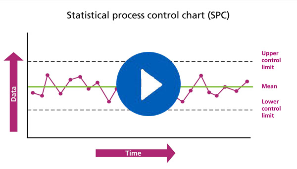
A Statistical Process Control (SPC) chart helps to see what is different to the norm. It charts changes over time and shows data plotted in time order.
Statistical Process Control (SPC) charts Read more »
A Statistical Process Control (SPC) chart helps to see what is different to the norm. It charts changes over time and shows data plotted in time order.
Statistical Process Control (SPC) charts Read more »
This diagnostic tool helps to identify strengths and weaknesses in implementation plans.
Sustainability model Read more »

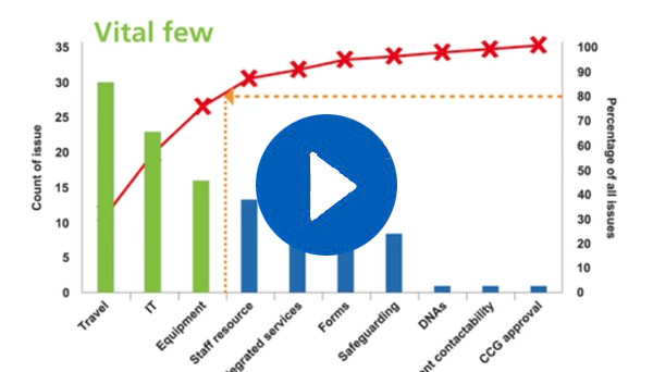
A Pareto chart is a type of chart which contains both bars and a line graph. It displays categories of data in descending order. A Pareto chart will highlight the most important among a set of factors.
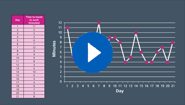
Run chart is a line graph of data plotted over time. It will help you find trends and patterns. It is a simple way to help analyse information.

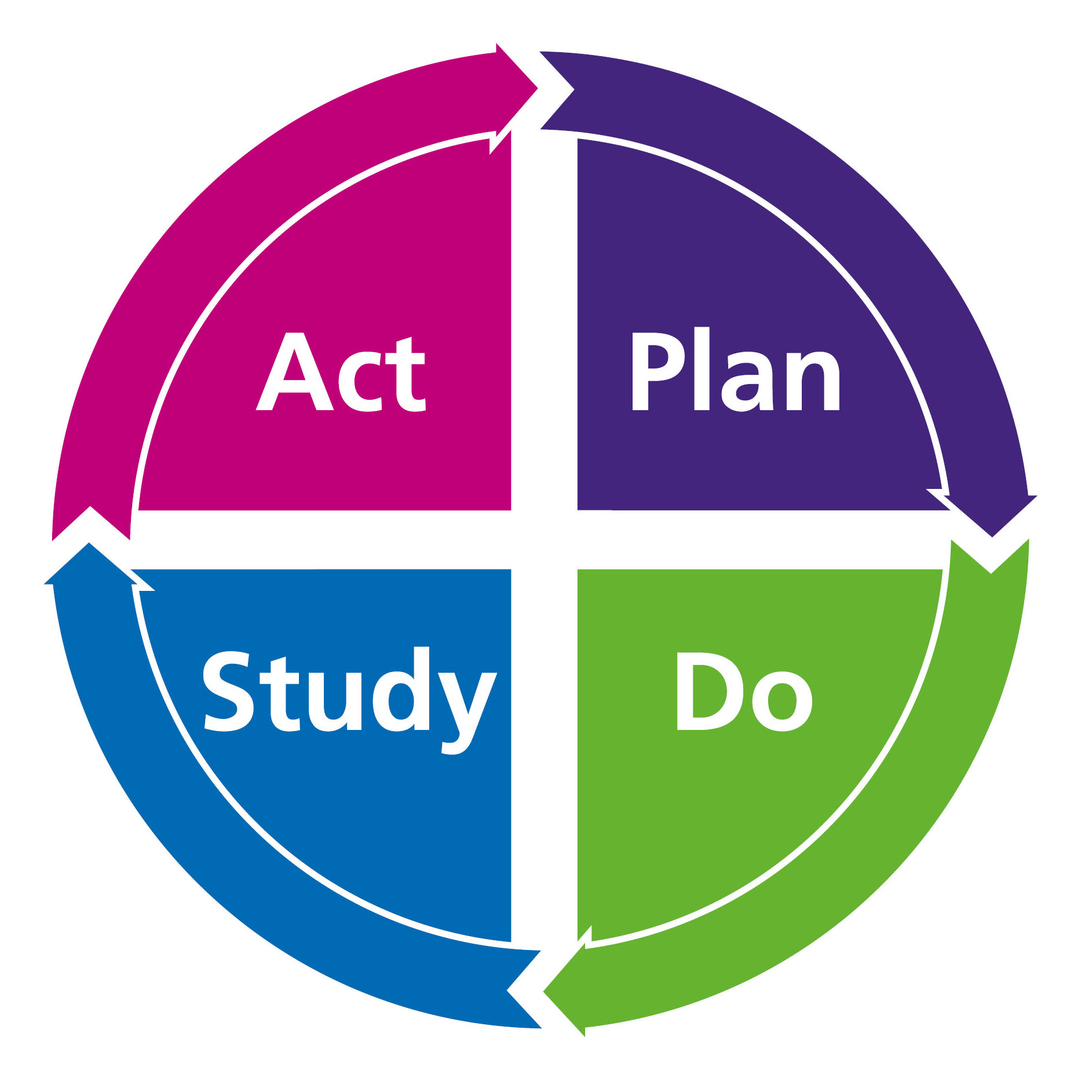
You can use PDSA cycles to test an idea, by trialling a change on a small scale and assessing its impact.
Plan, Do, Study, Act (PDSA) cycles Read more »
To generate lots of new ideas try a brainstorming session. This is a group creative technique to gather a list of ideas.

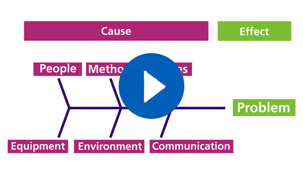
A fishbone diagram, also called a cause and effect diagram, or an Ishikawa diagram, is a visualization tool for categorizing the potential causes of a problem, in order to identify its root causes. The design of the diagram looks like a skeleton of a fish, hence the name.
Involving stakeholders in your project means speaking with all those whose interests should be taken into account.

SMART stands for specific, measurable, achievable, relevant and time bound – and SMART aims can be used to provide a structured approach to developing and designing a work plan.
